


Mobile Friendly vs Mobile Responsive: What's the Difference?
If you're reading this on your phone or tablet, then you already know the importance of making your site mobile-friendly.
But what about mobile-friendly vs mobile-responsive? And how is it different from simply making your site mobile-optimized?
When should you focus on one strategy or the other?
In this article, we'll answer these questions and more. We will explore the differences between mobile-friendly vs mobile-responsive vs mobile-optimized design strategies.
One of the most important things to remember is that Google ranks mobile sites above desktop sites for SEO if you use a smartphone to search.
An Overview
The difference between mobile-friendly, mobile-optimized, and responsive design goes as below.
Mobile-friendly is an approach that makes minor tweaks to a desktop-version website so that one can use it on mobile phones as well.
A mobile-optimized website is specifically for mobile devices, while mobile responsive is a responsive website adjustable in its size and layout to fit even on a smaller screen.
Still not that clear?
Well…Think of it like this –
A mobile-friendly design tells the website: “Let's shrink, remove some text, and adapt the desktop site so we can use it from a smartphone.”
A mobile-optimized design will tell the website: “Hey website, you're being viewed on a mobile phone, so please display your stand-alone version specifically designed for mobile devices.”
A responsive design will tell the website “Hey website, format yourself to fit these exact dimensions of the device you are being viewed on.”
Let's see each of these designs specifically…
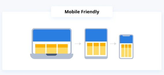
What Is Mobile-Friendly Web Design?
A mobile-friendly site works and looks exactly the same, regardless of the device.
It's also known as a dynamic display, and all functionalities remain unchanged.
 Mobile Friendly
Think of it as a slimmed-down version of the desktop.
It's an approach that makes small tweaks to a desktop version of the website so that it can also be used on mobile devices.
This means that the URL is the same, but the HTML and CSS (served up to the web browser) change depending on the type of device.
When building a mobile-friendly site (for the most part), there's no actual change in the functionality, and layout, except the webpage scale.
However, some features like drop-down menus, animations, or pop-up forms may suffer limitations when appearing on a device with a smaller screen.
In this case, for better usability and SEO purposes, every page element should be carefully designed so that they don't overlap when the page is shrunk down to the size of a smartphone.
What Is Mobile-Optimized Web Design?
This approach involves creating a stand-alone version of your website specifically designed for mobile devices.
Unlike the mobile-friendly one, this design uses separate URLs – one for desktop and one for mobile.
Also, in this case, the design starts from the smallest screen size (mobile device) and expands to larger screens like desktop browsers.
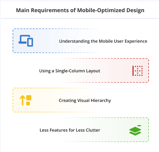 Main requirements of Mobile-Optimized Design – Source
As you can see, this is the opposite approach to mobile-friendly web design, where the goal was to take the large version and shrink it into a smaller size.
On top of that, mobile-optimized designs simplify the website by compressing images, shortening the information, and limiting text fields.
Similarly, they tend to avoid any animations, mouse-over effects, and pop-ups.
A Responsive Web Design Will Adapt to Multiple Screen Sizes
As you have figured out by the name, this type of website “responds” to the device it's being viewed on.
It automatically adapts the layouts to fit perfectly to any screen size.
Your website's elements render differently depending on the display's dimensions.
 Responsive Designs – Source
This means that you can adjust the browser window width from the widest to the thinnest, and your website will adapt to the different sizes.
It is focused on building a layout that adapts to the device by changing how the content, images, and other elements are displayed to perfectly fit the screen.
However, because of its adaptability and responsive nature, this approach to web design is often the most complicated and costly.
Is There a Clear Winner: Mobile Friendly vs Mobile Responsive vs Mobile Optimized?
While there are benefits to each, the real winner…No one!
Why?
Well (here comes my favorite answer to any SEO question) – it all depends on your business, needs, and budget.
Mobile-friendly websites can be a good first step, but it lacks some key features that can help with mobile search optimization and SEO.
The mobile-optimized design is a better option, but it can be a bit expensive to implement.
Furthermore, if you opt for a stand-alone mobile version, this will mean double the maintenance and resources.
On the other hand, a responsive web design is a great option for mobile website optimization as it provides the best mobile user experience.
However, this approach is often the most complicated and costly because of its adaptability.
Conclusion
No matter what you decide, one thing is clear…
…there is always a solution to making your website look and work great, even if you need a professional freelancer to lend a hand.
An important point to remember is that we live in a mobile-first digital world.
So, regardless of the design, you have in mind, pay attention to the mobile version of your website and keep it updated and optimized for search engines.