Mobile UX Design: Best Practices for Better SEO
Mobile UX design has been evolving at a rapid pace, especially when it comes to search engine optimization (SEO).
The two often go hand in hand, with Google rewarding businesses that provide its users with the best mobile UX design experience, allowing mobile websites to show up higher on its search results pages.
But first…
What Is Mobile App UX (User Experience) Design?
Mobile app UX design is the process of creating a user experience for mobile app users that is both useful and satisfying.
The Interaction Design Foundation defines mobile user experience design as: “the design of user experiences for hand-held and wearable devices…focused on accessibility, discoverability, and efficiency.”
So, in order to create a good mobile UX, designers must consider the mobile user’s needs and objectives, as well as the limitations of the mobile platform.
Additionally, designers must create user interfaces that are easy to use and visually appealing. Here are some examples of good mobile UX design
Why Is Having Good Mobile UX Important?
Good mobile UX design is important because it can help improve your website’s search engine optimization (SEO).
When mobile users have a positive experience on your website, they are more likely to stay and continue engaging with your content and even purchase if that’s your goal.

This reduces your bounce rate and increases the chance that users will visit other pages on your site, which can lead to more conversions.
Good mobile UX design can also help improve your click-through rate (CTR) because if mobile users are able to easily find what they are looking for on your site, they are more likely to click through to other pages.

Additionally, good mobile UX designs can lead to higher organic search rankings because Google considers user experience when determining its search results.
Design Practices That Are Valid in 2023
1. Consider Scenarios in Which People Use Smartphones or Tablets
While both are mobile devices in a sense, the smartphone and tablet are very different.
For example…Tablets are typically used at home or while traveling, primarily for entertainment.
Meanwhile, smartphones are also for consuming content, but they’re primarily mobile devices for communication and information.
These differences should be kept in mind when designing your mobile website.
What does this mean in simple terms?
If your company offers entertainment, focus your design towards an audience with a larger screen size.
If you intend to offer quick information, then adjust the design for small screens and minimalism.
2. Remove Clutter from Your Mobile Site
A well-designed mobile website is uncluttered and easy to use.
All the elements on the screen should serve a purpose and be easy to understand.
This can be achieved by using clear and concise labels, icons, and buttons.
Navigation should be easy to find and follow, and your audience should be able to complete tasks with minimal effort.
If your user interface requires the mobile user to take several actions or has too much content, then provide them with some guidance, so they understand the next steps.
However, try to do so without making it complicated.
3. Avoid Multi-Level Menus and Keep It Simple
One of the most critical mobile UX design principles is to keep things simple.
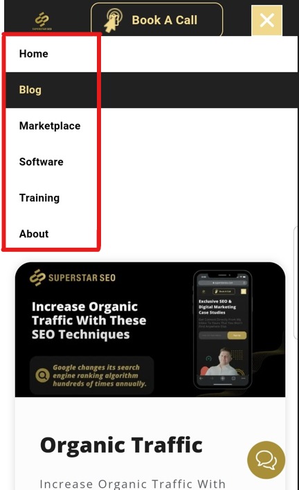
So, avoid multi-level menus, as an accordion-style drop-down menu would work better.

Imagine if you are glancing at your mobile phone while walking around the house.
I bet you wouldn’t like navigating through four or five levels of menus to find what you need.
That’s why an accordion-style menu is easier for users to navigate, which as a result, will help improve your SEO.
Another important tip is to use large, easy-to-tap buttons.
This will help improve your website’s usability and make for a smooth mobile user experience.
4. Keep in Mind Various Touchpoints
Users’ hands come in different sizes, so it’s essential to keep that in mind when designing for mobile devices.
So, buttons must be big enough to receive the touch but not too large as they may overlap with other functions.
Understand that some users might navigate with an older directional-style keypad, so you may need to adjust touch areas if needed.
You also need to consider how people hold their mobile phones and how they use them.
For example, one-handed use is becoming more common as people use their phones while doing other things.
You must ensure your buttons and menus are easy to reach and use.
Another thing to keep in mind is that mobile users are often on the go, so you need to think about how your app will be used in a car or while walking.
All of these factors will help you create a better mobile UX design and user interface.
Final Words
In conclusion, following mobile UX design best practices can help improve your website’s SEO.
Some common mobile UX design principles include using large fonts and buttons, minimizing scrolling and clicks, and designing for different touchpoints.
By keeping users in mind from the start, you can create a better overall experience that will keep people coming back.


