


Mobile SEO Checklist: The Best Tips For Optimizing Your Site
No matter how good your website looks on a laptop or desktop computer, if it doesn't look good on mobile devices, you're not going to get many visitors on those devices. That's why we came up with this mobile SEO checklist to help you get more internet traffic.
Mobile devices and tablets are the go-to web browser for most people, so even if you have a fantastic desktop site design without mobile optimization, you won't see much in the way of traffic on those devices.
With the explosion of mobile search, the importance of your website's mobile optimization cannot be overstated.
According to Statista, in 2026, there will be over 303.6 million mobile internet users only in the US.
Keep in mind that mobile users are different from users who access the internet from a desktop computer, and you must engage with them differently.
So, whether someone is visiting your site on a mobile device, tablet, or laptop computer, there are some common mistakes to avoid when optimizing it for mobile visibility.
1. Create an Intuitive Mobile UX
Mobile optimization and UX have progressed a lot since the first iPhone was launched in June 2007, but there are still more problems to overcome.
Like everything in mobile UX design, developing the best possible experience for users is a process of compromise.
After all, you have to understand that you're never going to please everyone.
However, you can strive to please the largest volume of mobile traffic visiting your site.
So, for example, single-column layouts generally provide the best experience on mobile devices.
Also, narrow mobile devices increase scrolling, so you must consider this too (among other stuff) in your layouts and content.
2. Consider Responsive Web Design
Many experts suggest you separate your URLs.
This means you should have a different URL for your mobile website and a different one for your desktop website.
However, Google advises against it as it increases complexity for website owners.
 Separate URL – Source
So, by using responsive web design, your site will look great on any device.
This is a setup where the server sends the same HTML code to all devices, and then CSS is used to alter the rendering of the page on a specific device.
If your web pages and all their elements (CSS, JavaScript, and/or images) are crawlable, then Google's algorithms should be able to automatically detect this setup.
3. Optimize Your Page Speed
A responsive design is essential for delivering a fast, smooth experience to users on all devices.
So, ensure your website is designed using responsive principles so it can adapt to any screen size as quickly and smoothly as possible.
After all, page speed can significantly affect SEO.
Also, it's recommended that you minimize HTTP requests.
This means reducing the number of files that need to be loaded in order to display your content.
To master your site speed, try also optimizing the sizes of your photos or videos.
Big visual and animation files can slow down site speed, so reduce visual file sizes when possible for faster loading.
 Loading times – Source
4. Make Good Use of the “Negative” Space
Mobile devices have smaller screens, so it's essential to correctly use the negative space (AKA white space) on your website.
Negative space is that empty space between your design elements.
By using this empty space correctly, you actually make your content easier to view and better to read.
Gather similar information to specific clusters if you have lots of information to include in your site design.
So, use the negative space to separate information and indicate what content goes where.
Make mobile content easy to read on your web page to ensure a higher site ranking on any search engine results.
5. Fix Broken Links
One of the most important things you can do for your mobile site is to fix any broken links.
This mobile SEO checklist item is important for a few reasons.
First, broken links make for a bad user experience.
Second, they can prevent search engines from indexing your site properly.
Third, they can hurt your mobile conversion rate.
And lastly, broken links waste people's time by taking them to irrelevant pages and leading them to abandon their purchases.
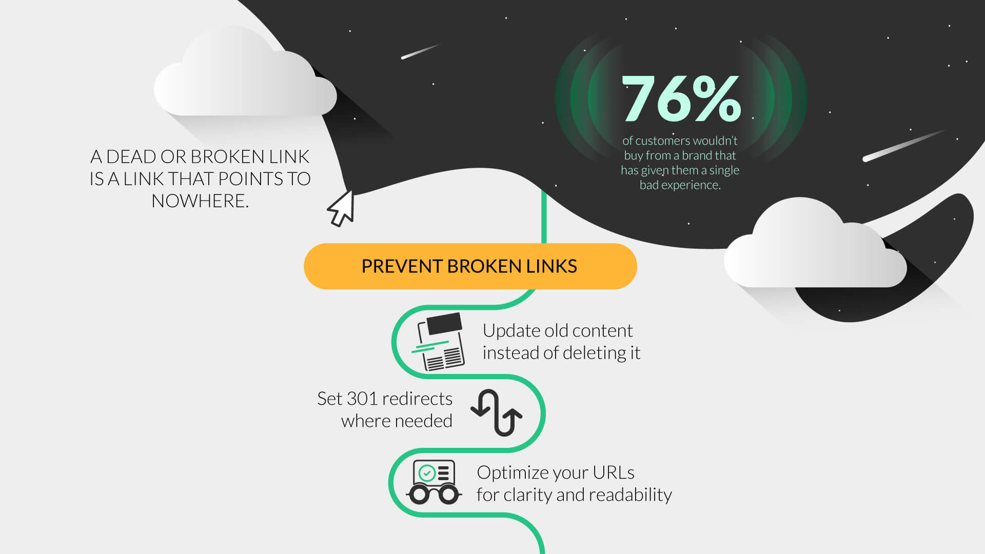 Broken Links – Source
So if you want to optimize your mobile site effectively, this is one of the first items on this mobile SEO checklist you should address.
Conclusion
There are many factors that affect your website's search rankings in search engines, and some of them are out of your control.
Your site's content, speed, and backlinks can increase your website's traffic.
So, if you want to ensure your website is optimized for mobile users, start by creating a mobile SEO checklist.
This checklist should include all the essential elements of mobile optimization, from design to content to technical aspects.
As long as your optimization techniques are focused on improving your users' experience instead of pushing for the highest rankings, you'll always be on the right track.